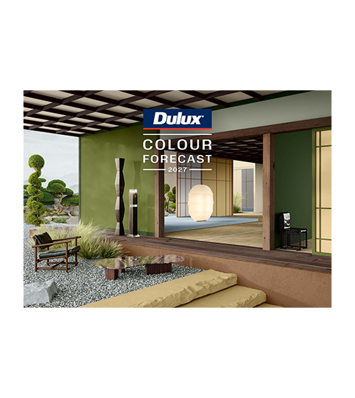
Colour Forecast 2027
Offering palettes that reflect a balance of calm and energy, that offer both quiet refuge and expressive freedom.

Offering palettes that reflect a balance of calm and energy, that offer both quiet refuge and expressive freedom.

Colour Forecast 2027
The Dulux Colour Forecast 2027 offers a forward-looking lens on the cultural shifts redefining how Australians live. As ideas of home, family and work continue to evolve, this year's palettes capture a directional shift away from perfection driven and digitally curated living. Instead, there is a growing preference towards spaces that feel grounded, human and emotionally restorative, reflecting a desire to slow down, find comfort in everyday rituals, embrace imperfection, and surround ourselves with meaningful stories and personal connections. The result is a collection of colours that balances calm and energy, creating interiors that offer both quiet refuge and expressive freedom.
The Dulux Colour Forecast 2027 introduces a spectrum of nuanced hues that range from grounding, nature-inspired greens to rich jewel tones and playful blues. Berry shades, deep browns, bursts of orange and buttery greens come to the fore to provide inspiring and nurturing atmospheres across residential and commercial environments. These palettes encourage a harmonious balance of style and sustainability, fostering personal expression and versatility within any space.
Each palette features colours from across our decorative paint coatings and Dulux Powder Coat colours.
The full 2027 Dulux Colour Forecast range is available as a brochure download below or visit the Dulux Specifier site here.
You can review the 2027 Dulux Colour Forecast Powder Coat colours for each trend below and order sample swatches.
Play
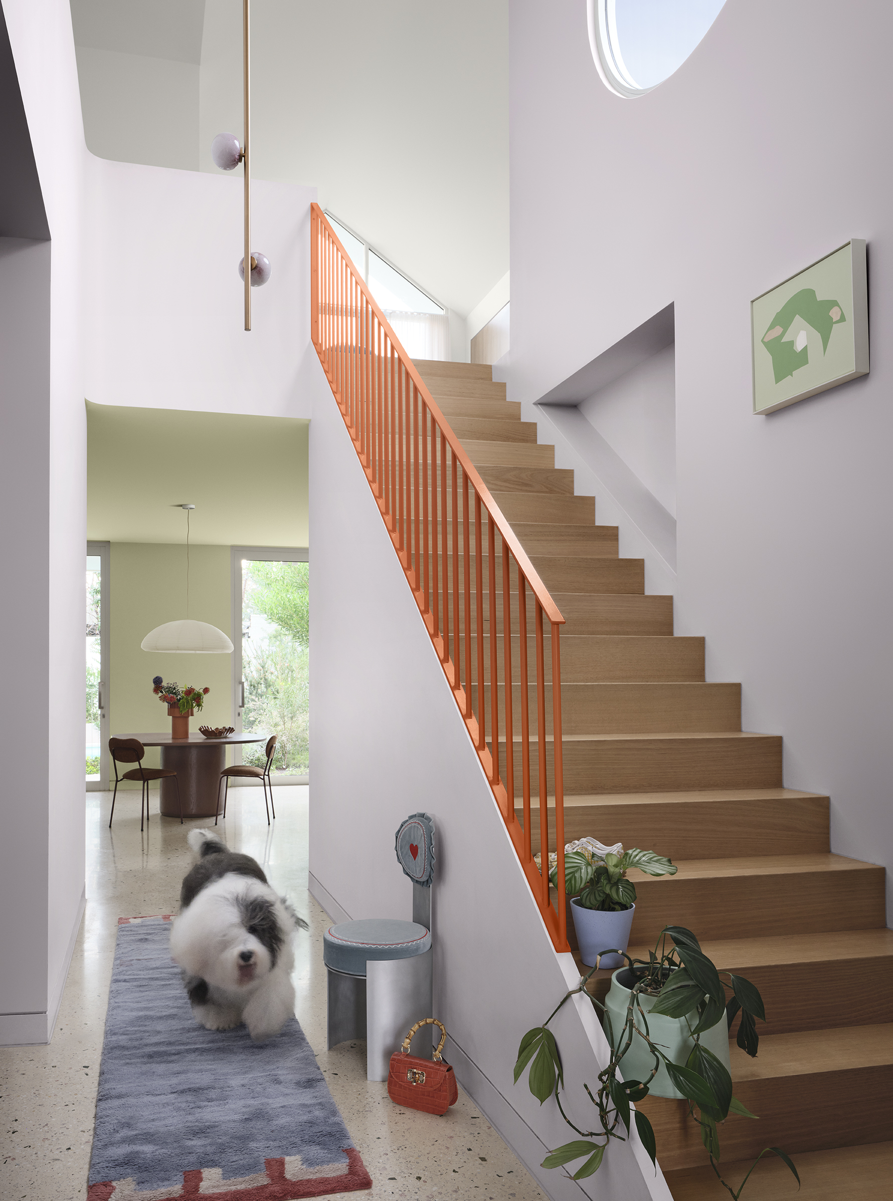
Play celebrates the joyful unpredictability of life and design, embracing creativity, connection, and the beauty of imperfection.The Dulux Play palette champions a more spontaneous and expressive approach to interiors, creating dynamic spaces that encourage interaction, curiosity and authentic self-expression. Inspired by a growing desire to reconnect with the physical world, its themes reflect a renewed appreciation for analogue experiences, shared activities, and the freedom to embrace life's imperfections. As we move away from polished perfection and screen-led living, Play creates room for experimentation, individuality and moments of genuine connection.
|
 Photographer: Lisa Cohen | Styling: Bree Banfield |

Matt
2721380M

Matt
2727909M

Matt
2725498M

Gloss
90N4383G
Treasure
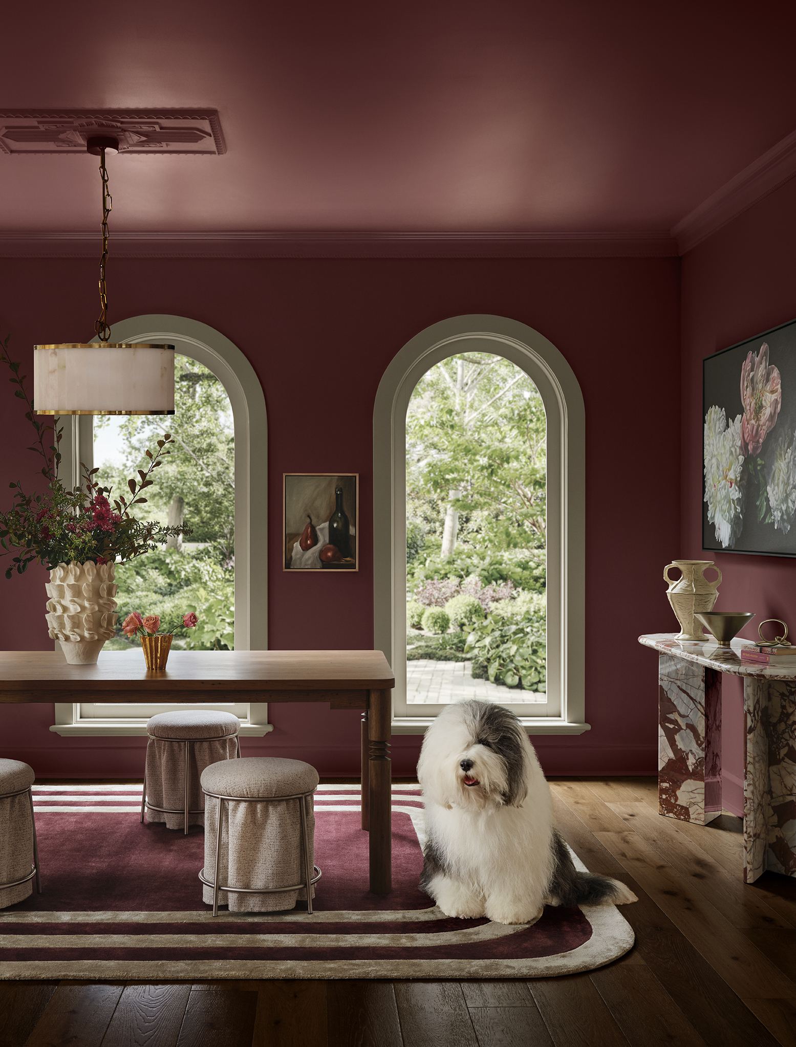
Treasure is an expression of storytelling and heritage, curating environments that envelop us in warmth through the beauty of collected memories.Rather than seeking opulence in excess, Dulux Treasure celebrates the intimacy of layers built slowly over time, expressed through jewel tones and heritage-inspired design. In response to a noisy and fast-paced world, we're gravitating towards spaces that feel personal, intimate and composed. The Treasure Powder Coat Palette |
 Photographer: Lisa Cohen | Styling: Bree Banfield |

Matt
91T8360M

Satin
2724134S

Flat
9068185F

Satin
2725125S
Sensory
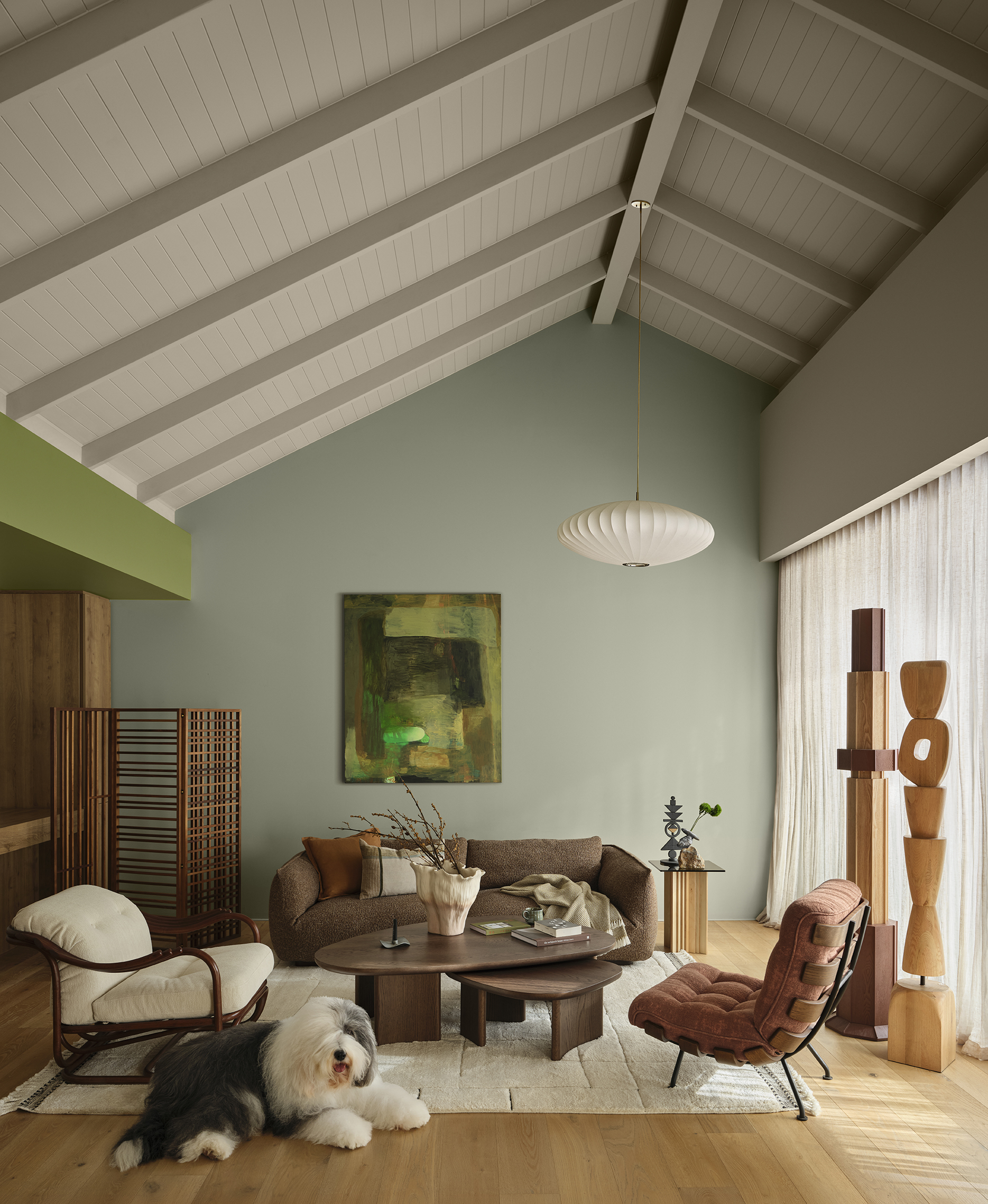
The Sensory palette is a tribute to mindful living and the beauty of rituals.Shaped by Japanese restraint, quiet structured order, and craftsmanship, these sensory moments bring calm and clarity, turning spaces into a sanctuary of reflection and restoration, where everyday acts become meaningful expressions of reassurance, steadiness and care. |
 Photographer: Lisa Cohen | Styling: Bree Banfield |

Flat
9E23245F

Flat
9068430F

Flat
9068184F

Matt
2726500M