Colour Forecast 2025
Presenting palettes that lean towards subdued hues and warm neutrals. Soft browns and the emergence of moody-grey undertones provides depth in each palette, affording spaces with a feeling of grounded cosiness.

Presenting palettes that lean towards subdued hues and warm neutrals. Soft browns and the emergence of moody-grey undertones provides depth in each palette, affording spaces with a feeling of grounded cosiness.

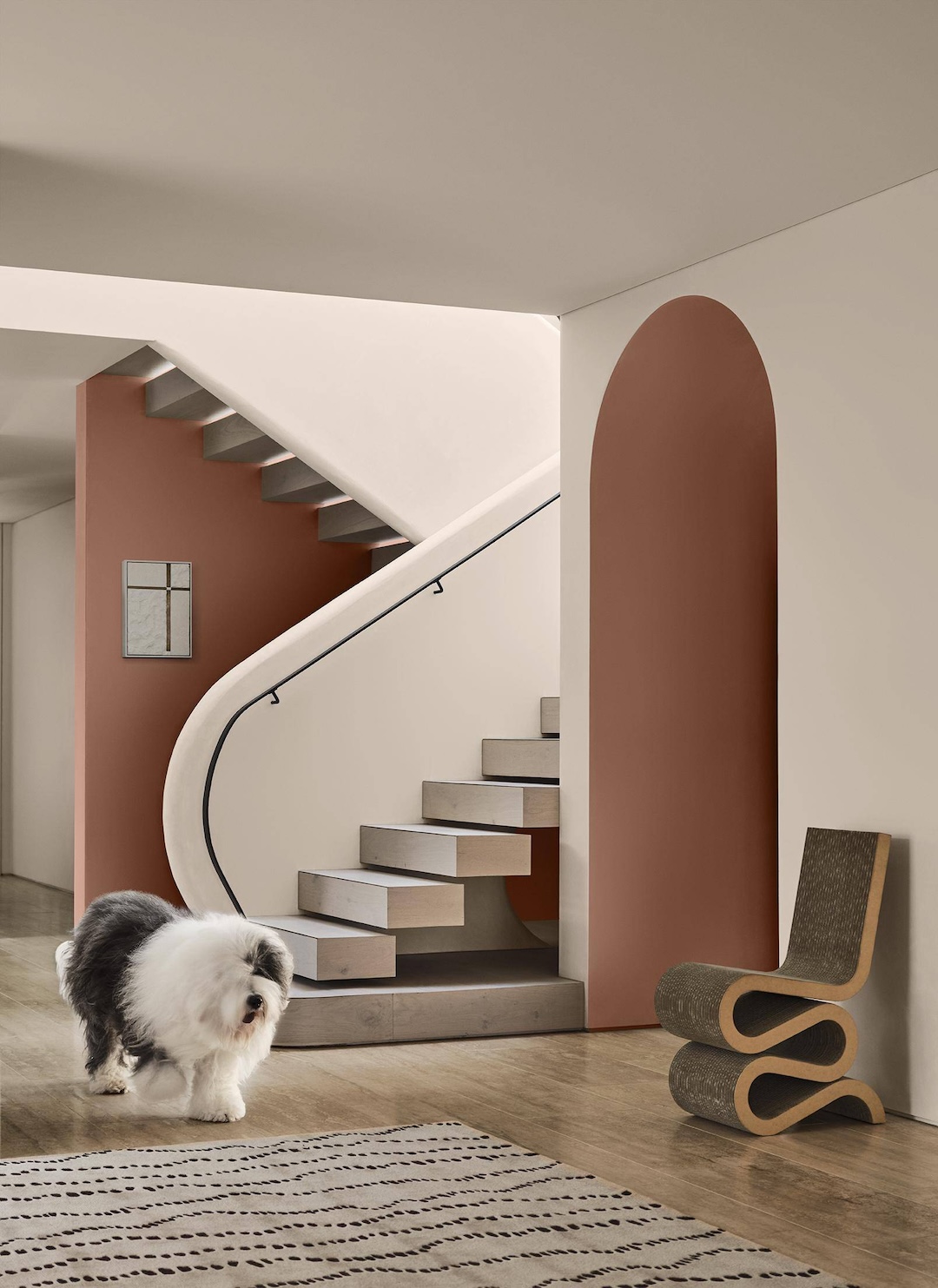
In 2025 the Colour Forecast palettes are more muted compared to previous years with a noted absence of clean, bright colours. Soft browns and the emergence of moody-grey undertones provides depth in each palette, affording spaces a feeling of grounded cosiness.
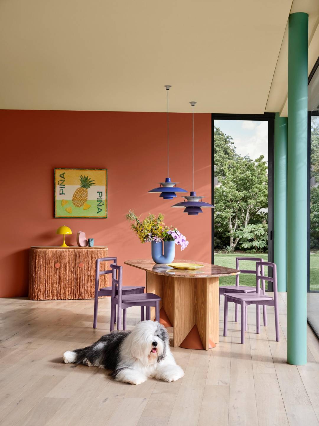
Distilled into three distinct palettes Still, Recollect and Emerge demonstrate how colours with warm, brown undertones play an important role in evoking a sense of nurture and positivity. In 2025, Dulux predicts that rich burgundies and wine hues will become more prominent throughout residential interior design, alongside an increased use of green including olive, sage and vibrant yellow-green.
When applied in commercial spaces such as retail and office areas, the Dulux Colour team says that there is no boundary on how each of the colours within the palettes could be used. Australian interior designers and architects have been leading the way in their expressive use of colour, which will no doubt continue in 2025.
Whilst tonal colour schemes have proven popular in years past, we will see more contrasting colour schemes begin to reemerge for a more energetic and sophisticated palette. Where neutral colour schemes are concerned, warmth and tactility will prove to be a key influence in any finished design.
With so many neutral colours including beiges, tans, browns and warm whites forming a base for accents of greens, blues or rich burgundies, the 2025 Dulux Colour Forecast palettes are suited to any architectural style. Each palette features colours from across our decorative paint coatings and Dulux Powder Coatings.
The full 2025 Dulux Colour Forecast range is available as a brochure download below or visit the Dulux Specifier site here.
You can review the 2025 Dulux Colour Forecast Powder Coat colours for each trend below and order sample swatches.
Still
Still – has an instantly calming effect that can create a nourishing and comforting environment.
The Dulux Still palette encompasses slow design with an appreciation for the beauty of the mundane and the comforting everyday rituals of life. Our need for living more presently goes hand in hand with our increased desire to have a greater connection with nature. As a result, the subdued palette is filled with calming neutrals with brown undertones, as well as grey mid-tone shades as accents that exude warmth and a sense of ease. There are lighter neutrals in the palette, working hard as a soft accent shade against the darker hues in the palette. A mellow terracotta and brown help ground the palette and sit alongside pale buttery yellows – a warm comforting shade for living rooms and bedrooms alike. Towards the cooler end of the palette, yellow based neutrals and greens blend with greyed-off and serene cool blues. The Still Powder Coat Palette |
|

Gloss
27284365

Satin
2728122S

Satin
27278126

Satin
27288480
Emerge
Emerge – influenced by shared housing arrangements, skill-sharing initiatives and activities such as clothing swaps that promote altruism and environmental stewardship.As greyed off purple blues emerge as a new colour direction in 2025 stepping away from clean and brighter shades, Dulux Emerge is a muted palette featuring a spectrum of uplifting almost-pastel shades that inspire joy and a light-hearted mood. Glossy surfaces, pearlescent finishes and translucency create light-play through glass, resin, perspex and paper, used innovatively in lighting. Tactile fabrics include coloured boucle, soft velvet and buttery suede to create a cosy mood, which are contrasted against powder-coated details offering durability and a refined matt texture. The Emerge Powder Coat Palette |
|

Gloss
27237131

Matt
2725498M

Matt
2724410M

Matt
2726541M
Recollect
Recollect – The moody and luxurious Recollect palette embodies a connection to heritage and nostalgia, leading to interiors that feel cosy, safe and familiar.Walls feature yellow-based greens, soft oranges and a vibrant coral alongside rich plum and grape shades as accent colours on trims or plush velvet furnishings. Providing relief to brown-based tonal schemes, we will see bursts of bright red come through as a fun accent. The second-hand influence is key for this trend, with furniture and decor elements spanning from the 1950s to the 1990s coming through. Whilst older generations can find comfort in the past, younger ones see newness and exciting opportunities to blend classic styles with modern decor – sourcing unique vintage pieces to express themselves in their own eclectic style. The Recollect Powder Coat Palette |

|

Matt
90Z1376M

Satin
2726473S

Matt
2724411M

Gloss
90N4007G
